
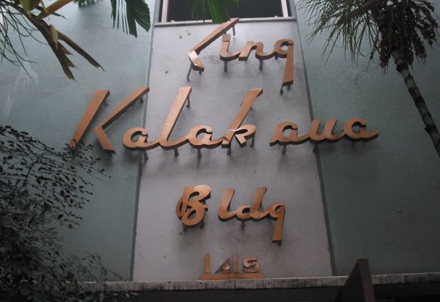
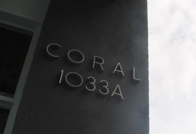

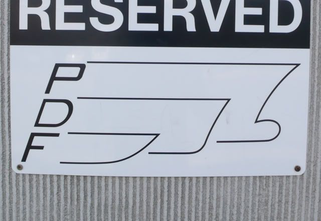
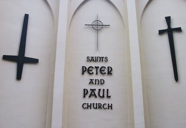
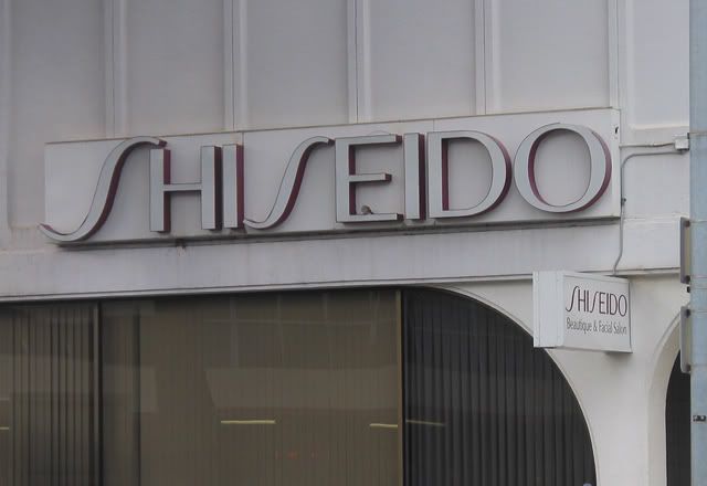

I've been lazy lately, even though I promised to do updates at least twice a week. To make up for it, here's a nice big post which I find more fun anyway, because it gives my visitors a lot more to look forward to. Some are examples of great type — the King Kalakaua, Shiseido, 1917, Coral 1033A, and the Saints Peter and Paul signs. The Occidental is an old classic, that deserves the title even though the kerning around the T is problematic. And the rest have a dandy charm that you don't always get from professionally-designed work. I am in particular fascinated by the bizarre quasi-3D lines extending from the P, D, and F. I don't really get it, but I'm sold.
(Incidentally, the Shiseido sign is gone, and I believe they might've restored the King Kalakaua. It was also pointed out to me that the "quasi-3D" on the PDF logo are the silhouettes of ship hulls. Duh, why didn't I see that? I'm positive I spent enough time as a kid drawing the space battleship Yamato.)


1 comment:
i'm sold too
Post a Comment