


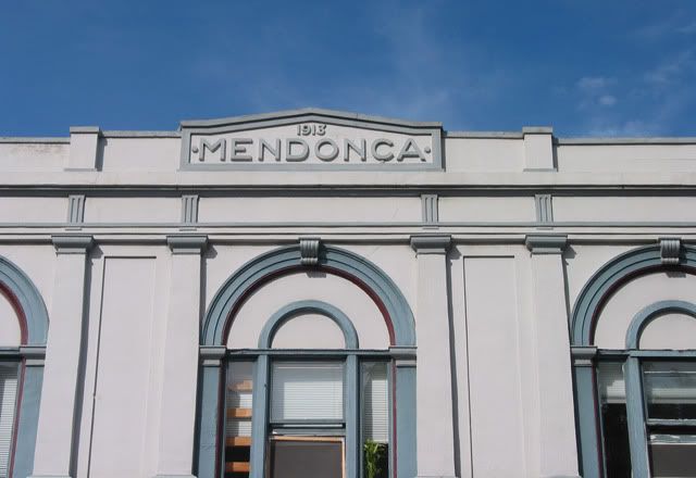
Granted, I throw in the occasional novelty – but for the most part the purpose of the Type-O series is to highlight exemplary type and lettering. This example is as plain as can be, but as Robert Bringhurst writes in The Elements of Typographic Style: "Once the demands of legibility and logical order are satisfied, evenness of color is the typographer's normal aim." Often, type varies in width and negative space, and although large blocks of reading text have consistent color, with display letters, such as titles, headers, signs, the inconsistencies become more obvious. Designers are often guilty of such oversight. Not so in this case: I cannot speculate whether the font came as such or if its designer modified it, but the negative space within the letters and between the letters are balanced, beautiful, restrained, and subtle. It doesn't get more perfect than this.


No comments:
Post a Comment